ABC REFRESH
An elastic, modern update of a timeless classic.
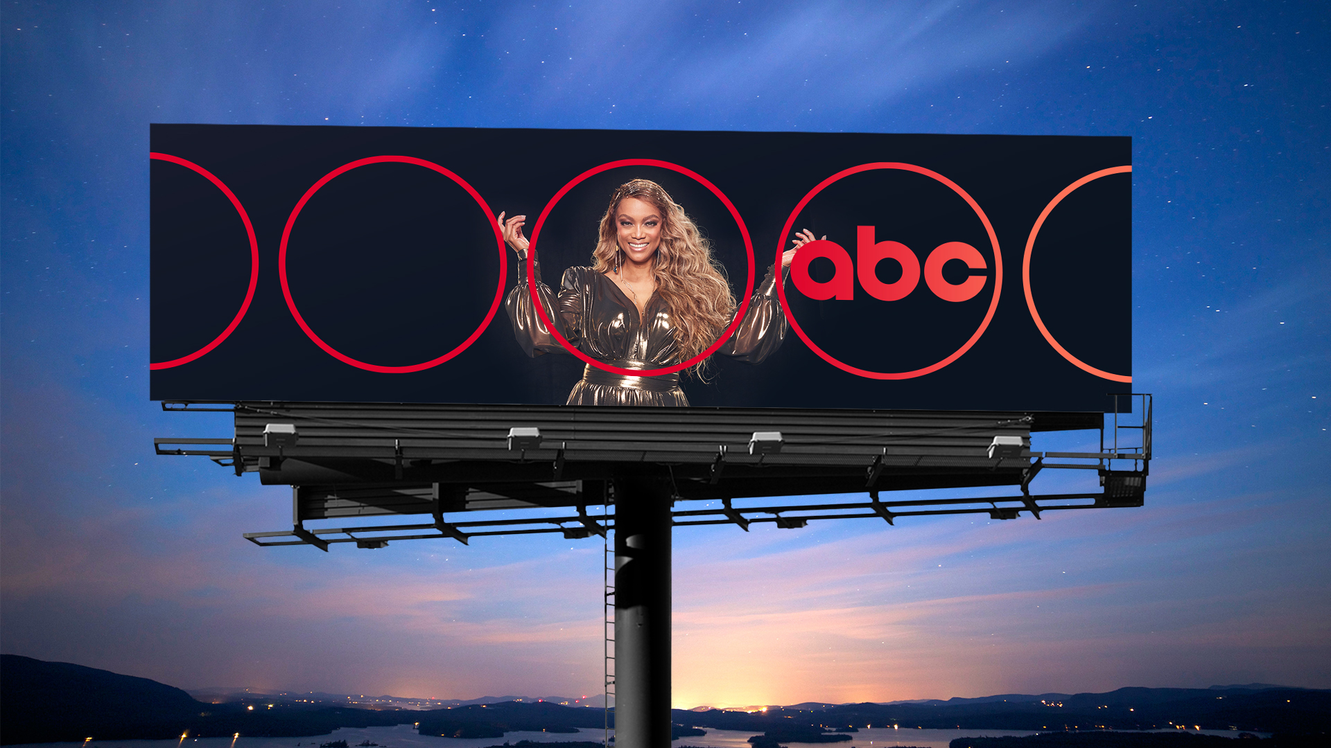
From polished glass to splashes of liquid light, Paul Rand’s original logo design has experienced many treatments over the decades. But for a brand that needs to come to life consistently across linear, digital, and practical platforms—not to mention numerous affiliates—3D treatments can create challenges. Taking inspiration from Rand’s flat, graphic design, we redrew the logo in two iterations—a hero “Rand” and its sidekick “Ring”—to empower effortless, consistent attribution at every scale without sacrificing an ounce of equity or audience affinity.
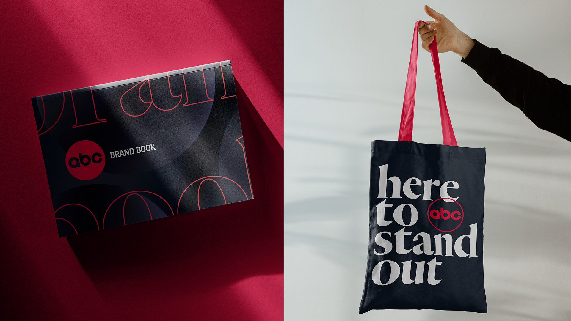
The new design system is alluring, elevated, & intelligently crafted for maximum consistency.
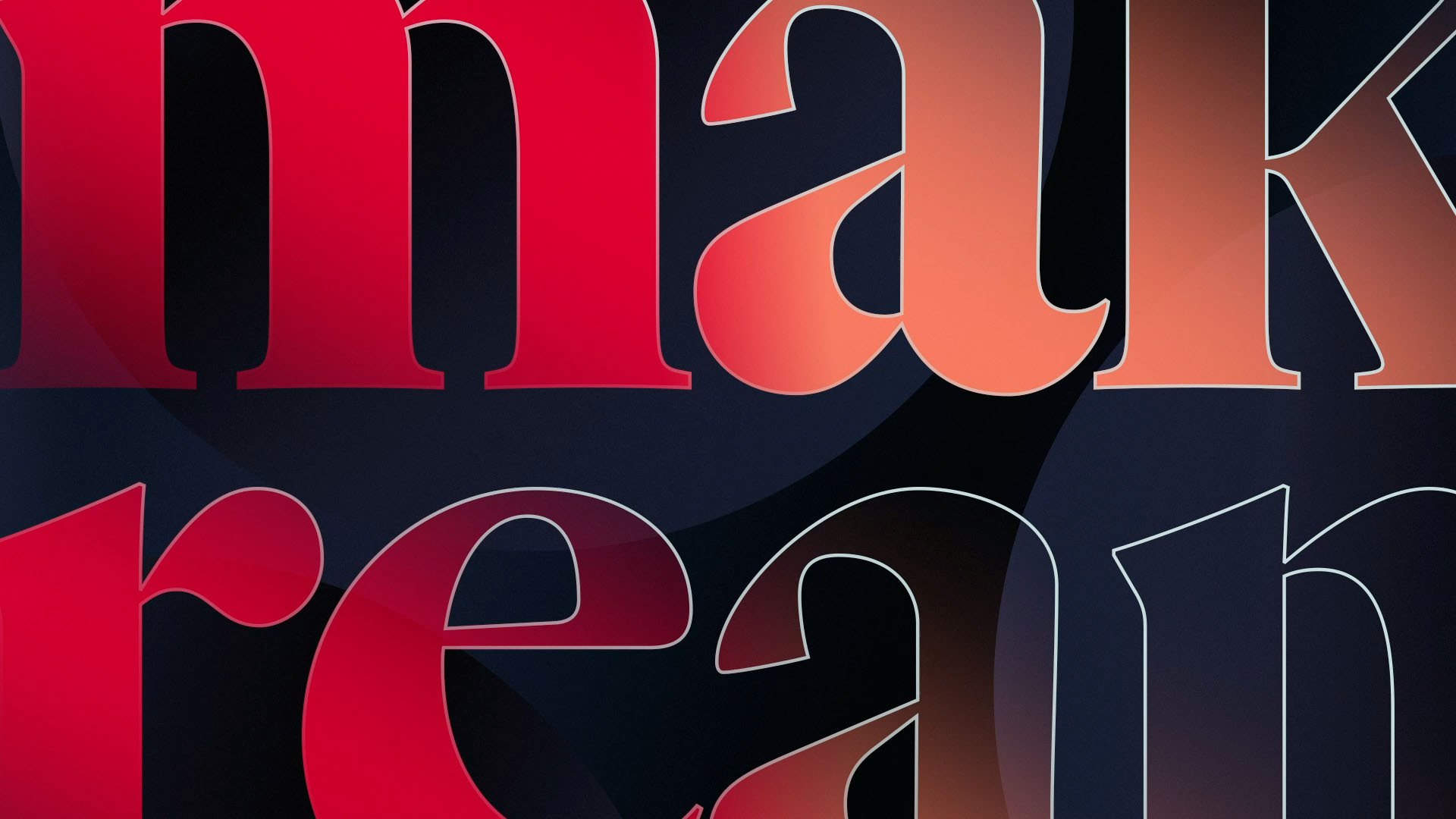
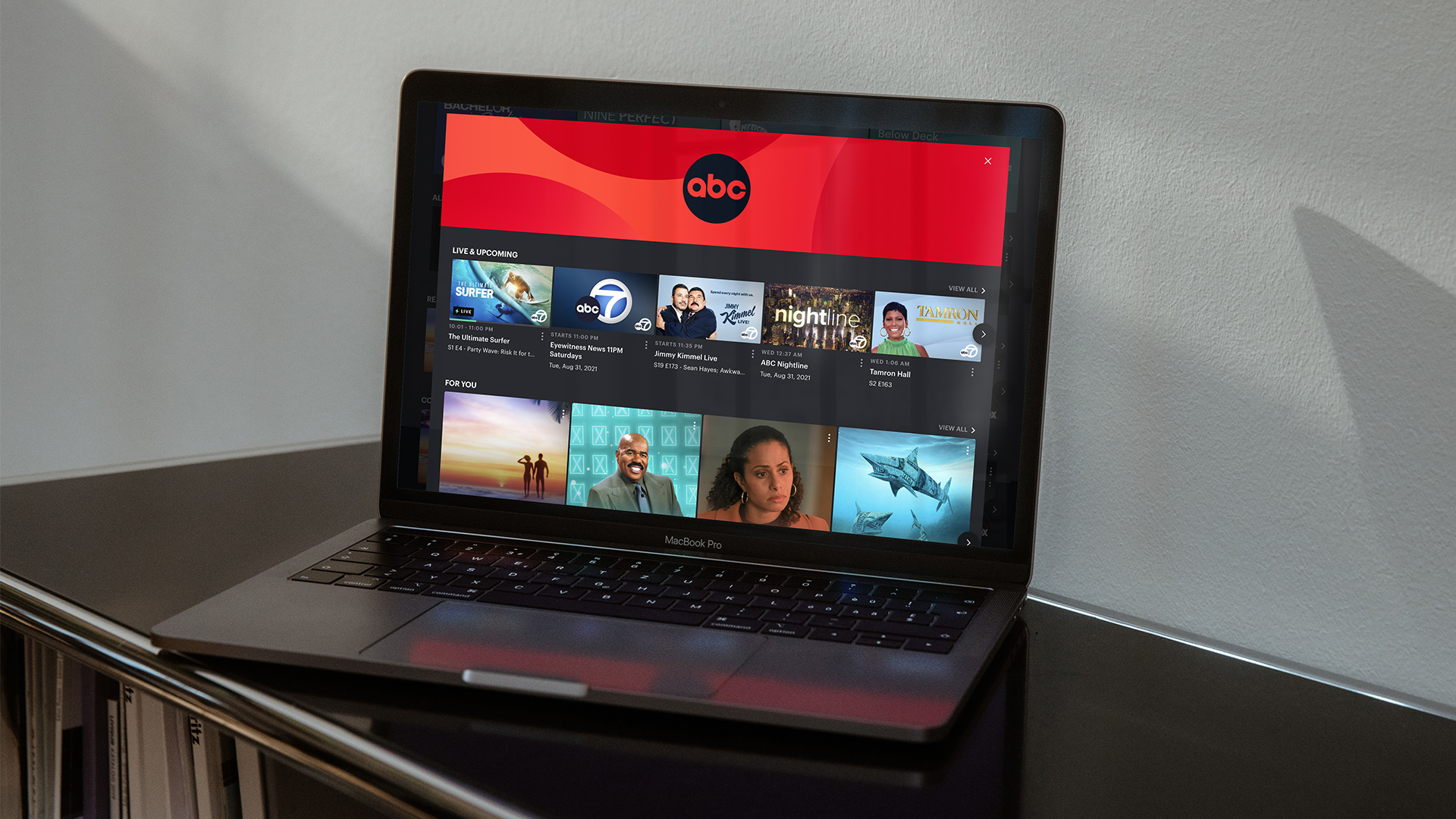
Leaning into the glamour and appeal of ABC red while leveraging the perfect circles found within the redrawn logo, ABC’s new cross-platform identity is deceptively simple and endlessly iterative. Befitting a brand driven by characters and committed to diversity, the design system allows talent to shine with pops of its own unmistakable personality. Complementary typefaces enable both information and expression, while the motion language flexes across the full spectrum of storytelling. Like the redrawn logo, ABC’s visual identity has been reduced and optimized, allowing the brand to shine on any stage.
See the full case study at Trollbäck+Company