MIXIBLE BRAND IDENTITY
Delightful, enthusiastic, playful—Mixible moves fast.
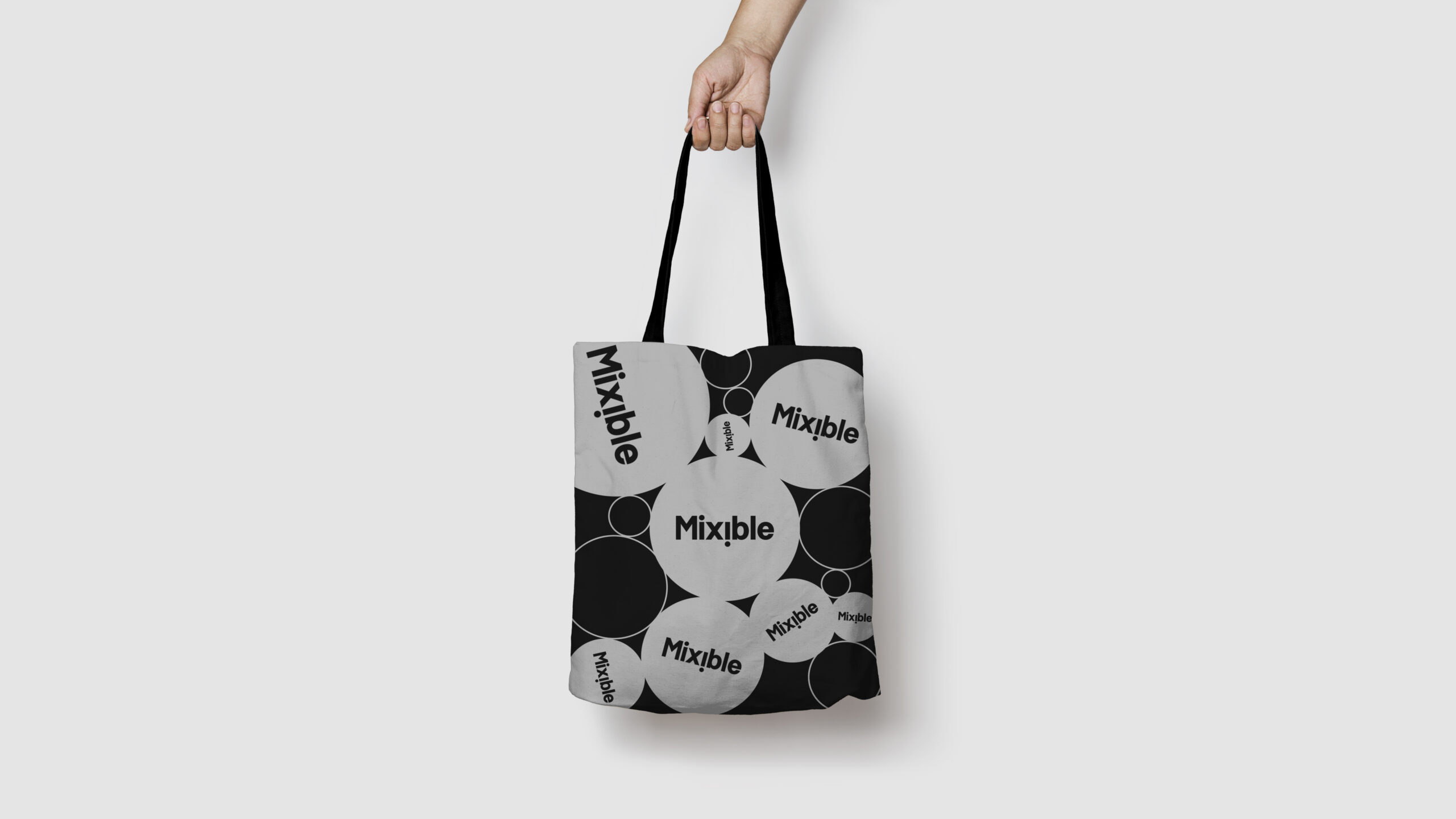
Mixible’s logo features clean, simple typography with a twist: the second “i” inverts into an exclamation point, eliciting surprise and delight, and infusing the name’s dynamic nature into the design.
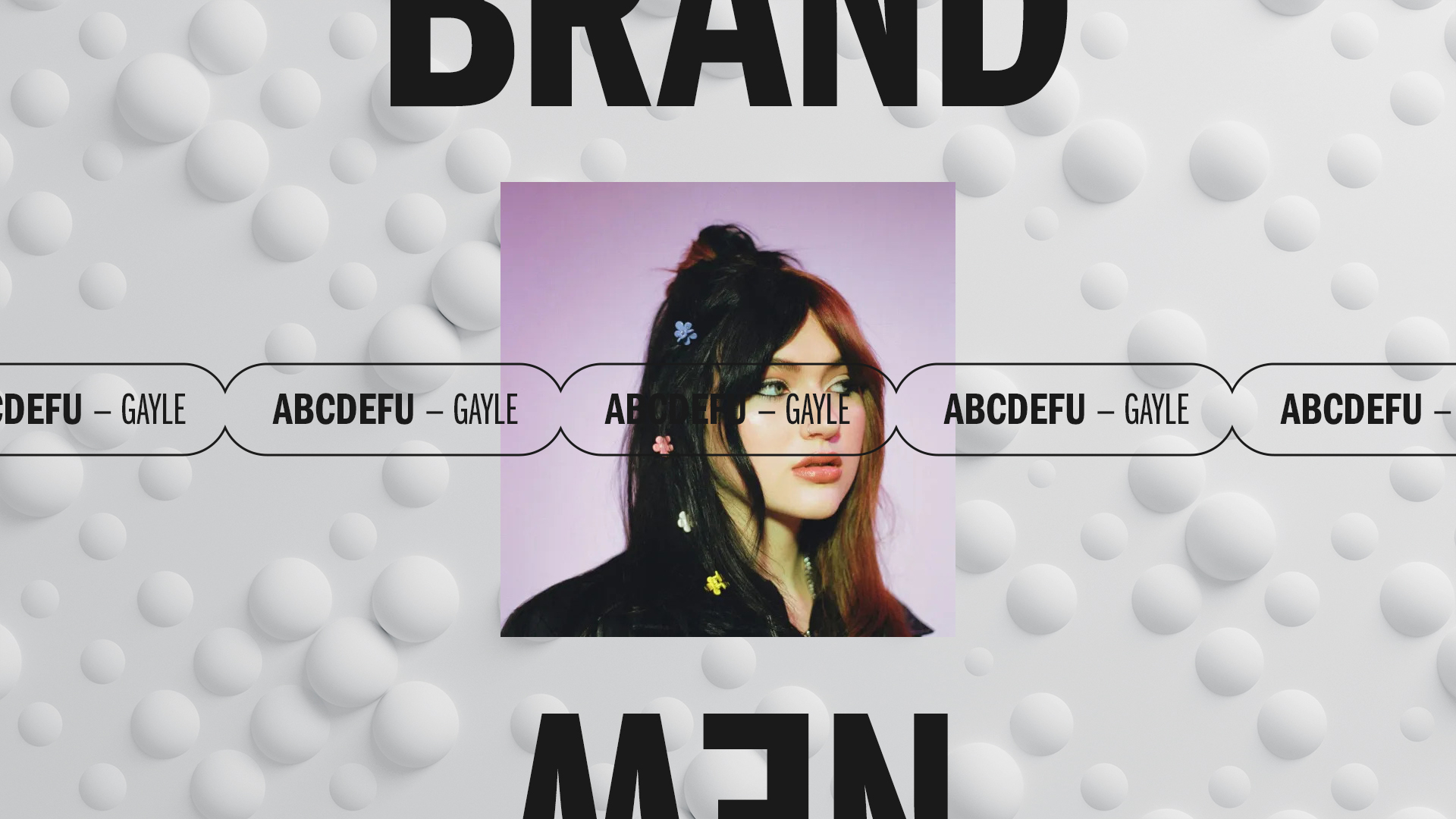
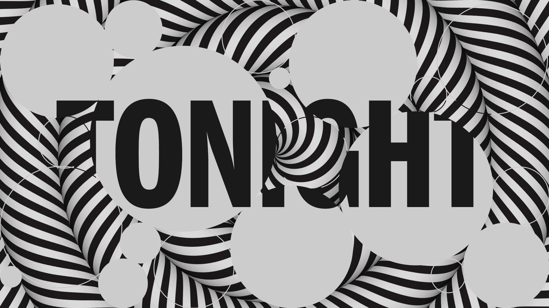
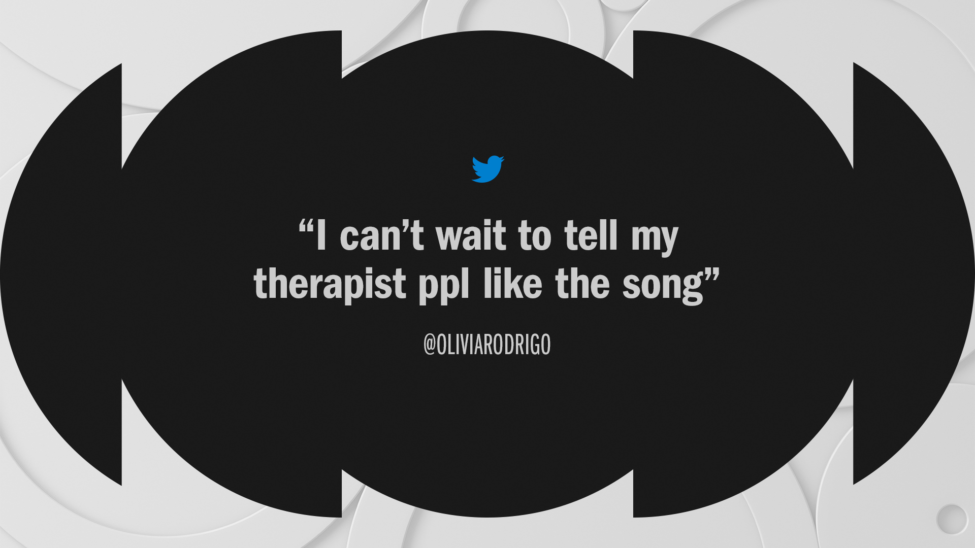
These symmetrical dots inspire how the larger design system comes to life. Multi layered black and white op-art graphics slice, dice, remix, and repeat this circular motif. The result is a vibrant, eclectic, and expressive system that’s always moving—and always Mixible.
Working in tandem with other brands.
Mixible’s black-and-white master brand gives it the flexibility to effortlessly pair with Paramount’s unique portfolio of network, studio, and streaming brands.
Our design system lifts a key color and logo from these partners, making the connection a seamless co-branding effort. Partner brand colors and logos become energizing accents, transforming into a dynamic expression of visual identity while driving attribution.
See the full case study at Trollbäck+Company